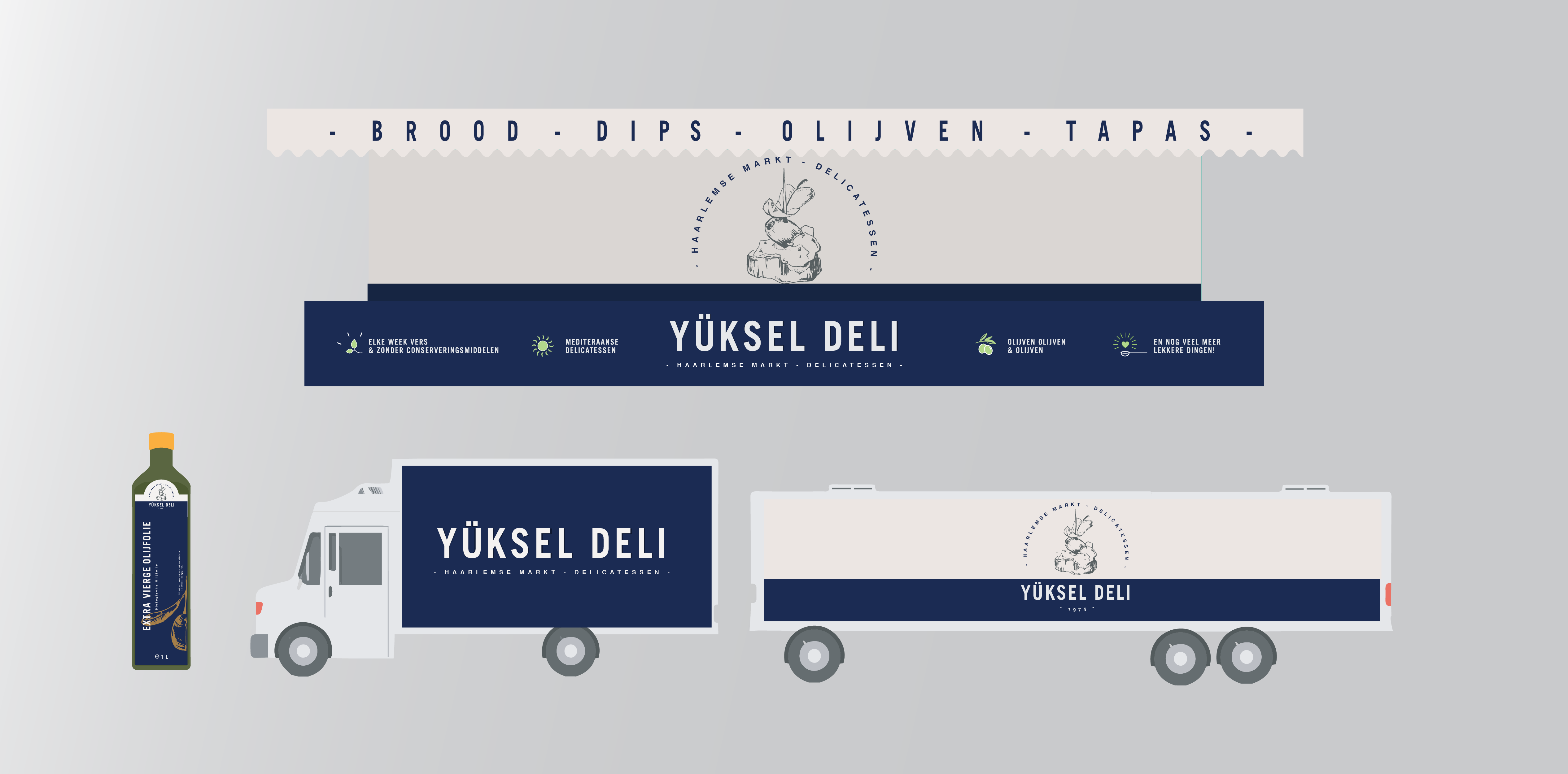
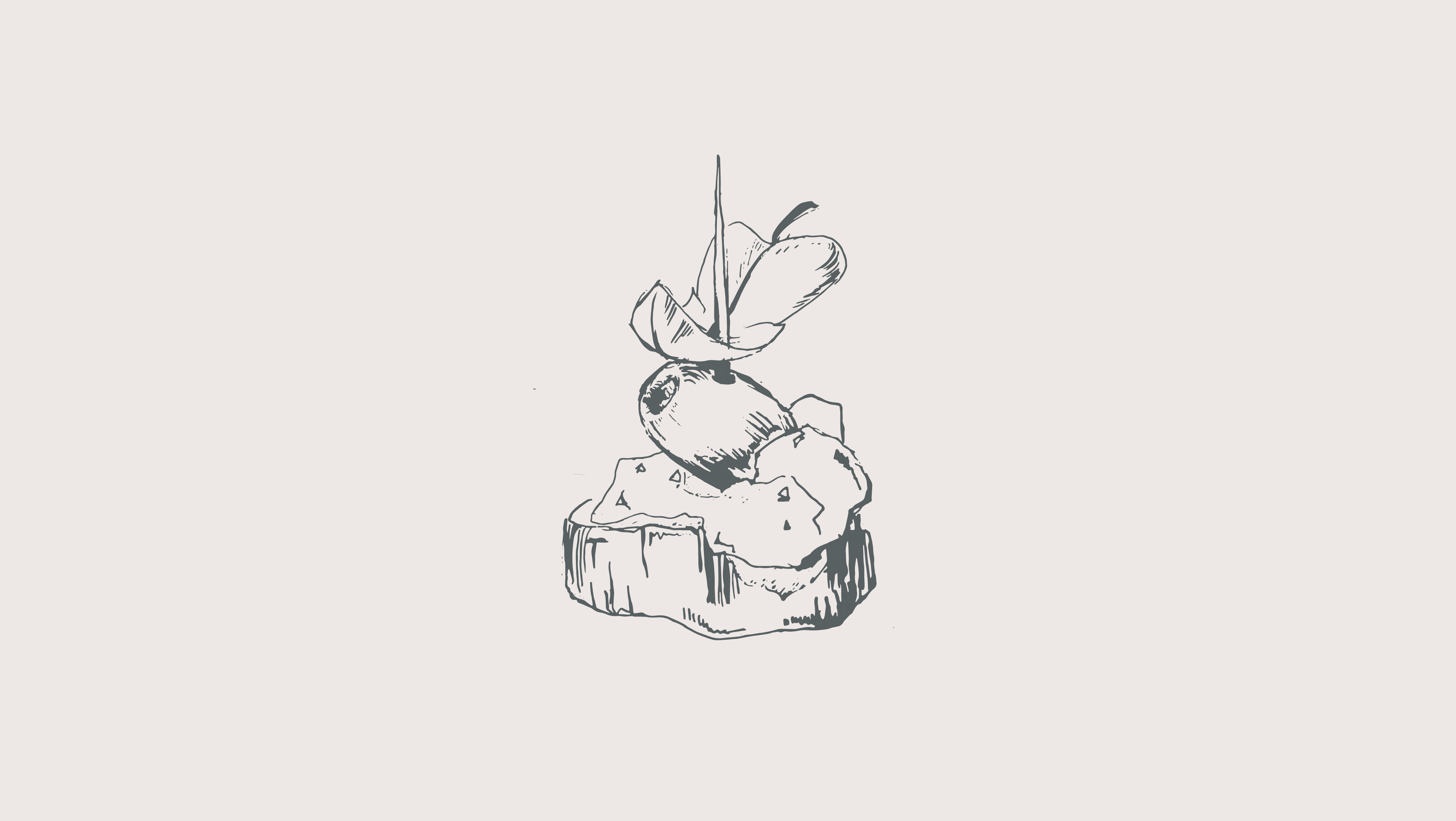
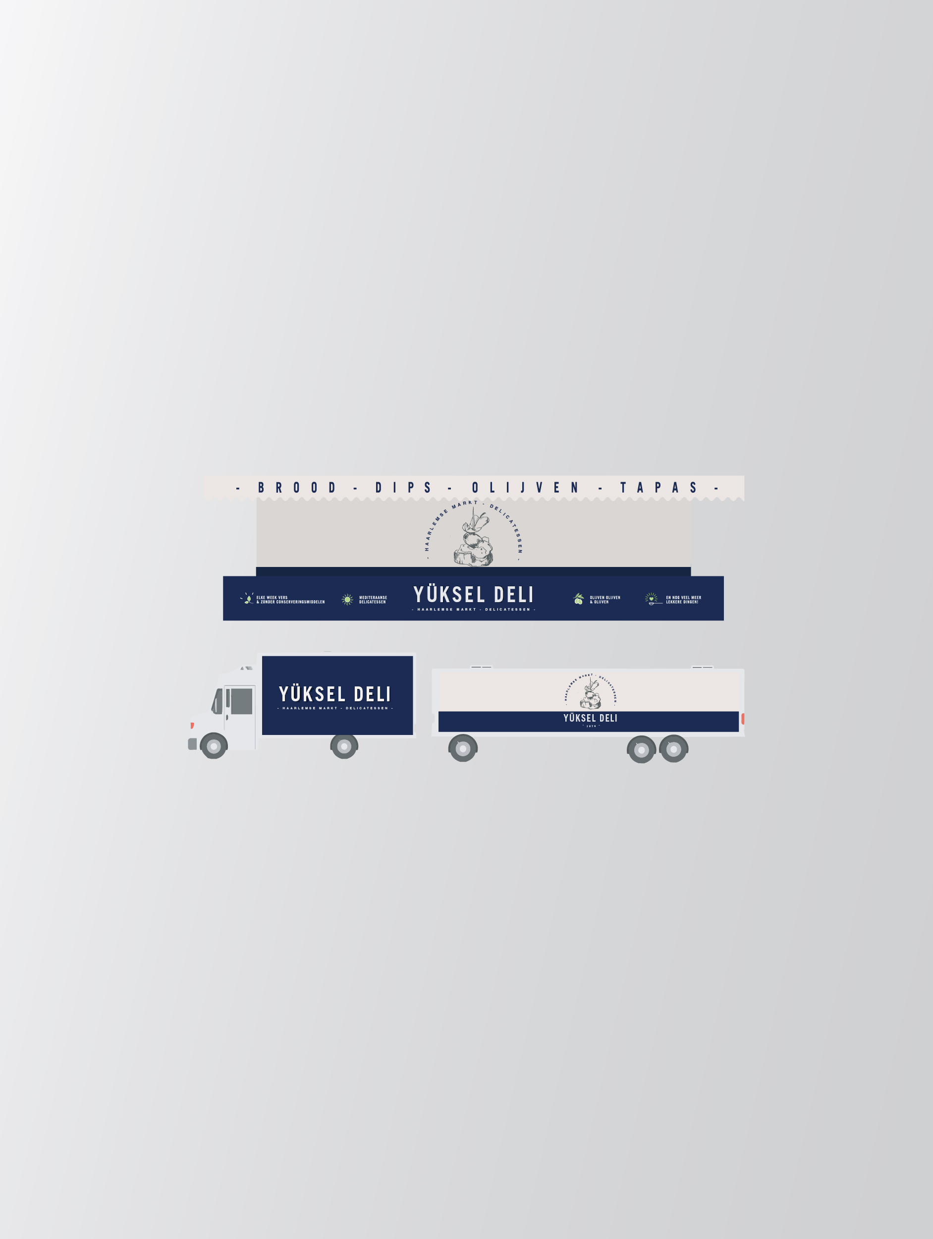
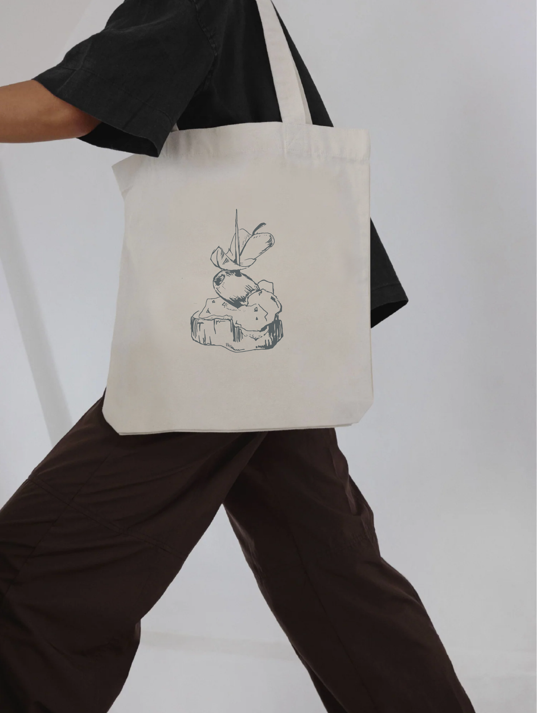
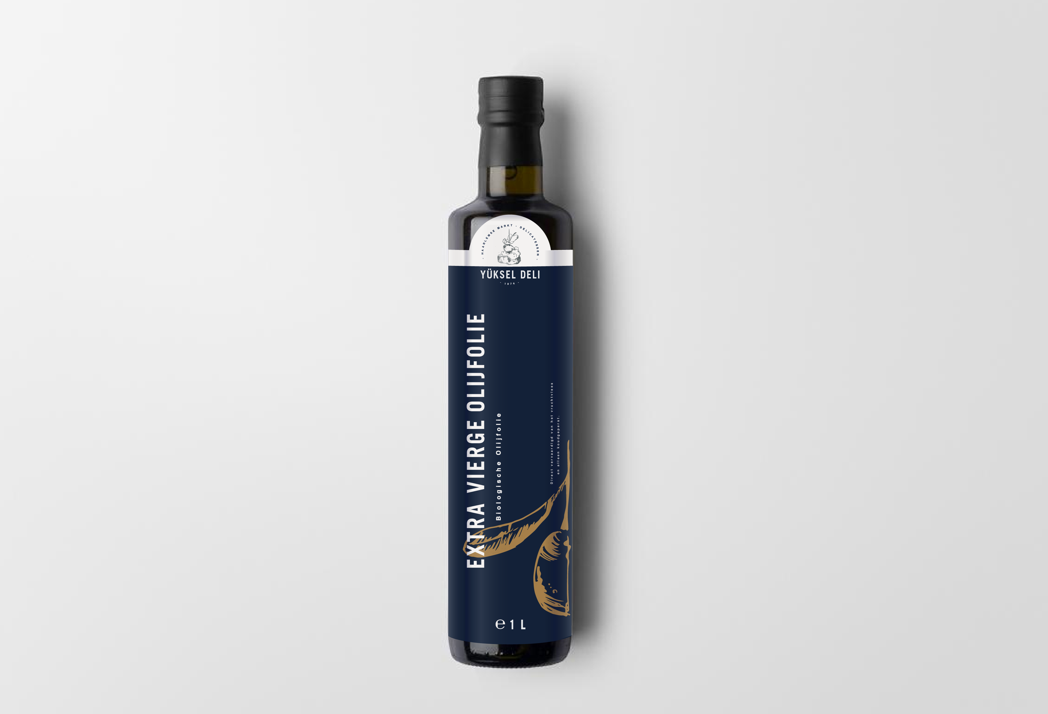
The process started by listening and understanding Seydi’s story, values, and passion for quality. After researching different markets and Turkish specialty stores, several design directions were explored. We chose dark blue to communicate quality and craftsmanship, fresh green to emphasize the freshness of the products, and beige for the back wall and canopy to keep the interior light and welcoming. The front of the stall was designed in dark blue to immediately signal professionalism. A hand-drawn icon was used as the foundation of the logo, supported by a custom icon set based on phrases Seydi often calls out at the market. These elements were integrated into the stall design to create a distinctive and authentic brand presence.


%20aan%20de%20voorkant%20van%20de%20kraam.JPG)

.gif)
%20kopie.gif)