We started by defining a clear brand strategy:
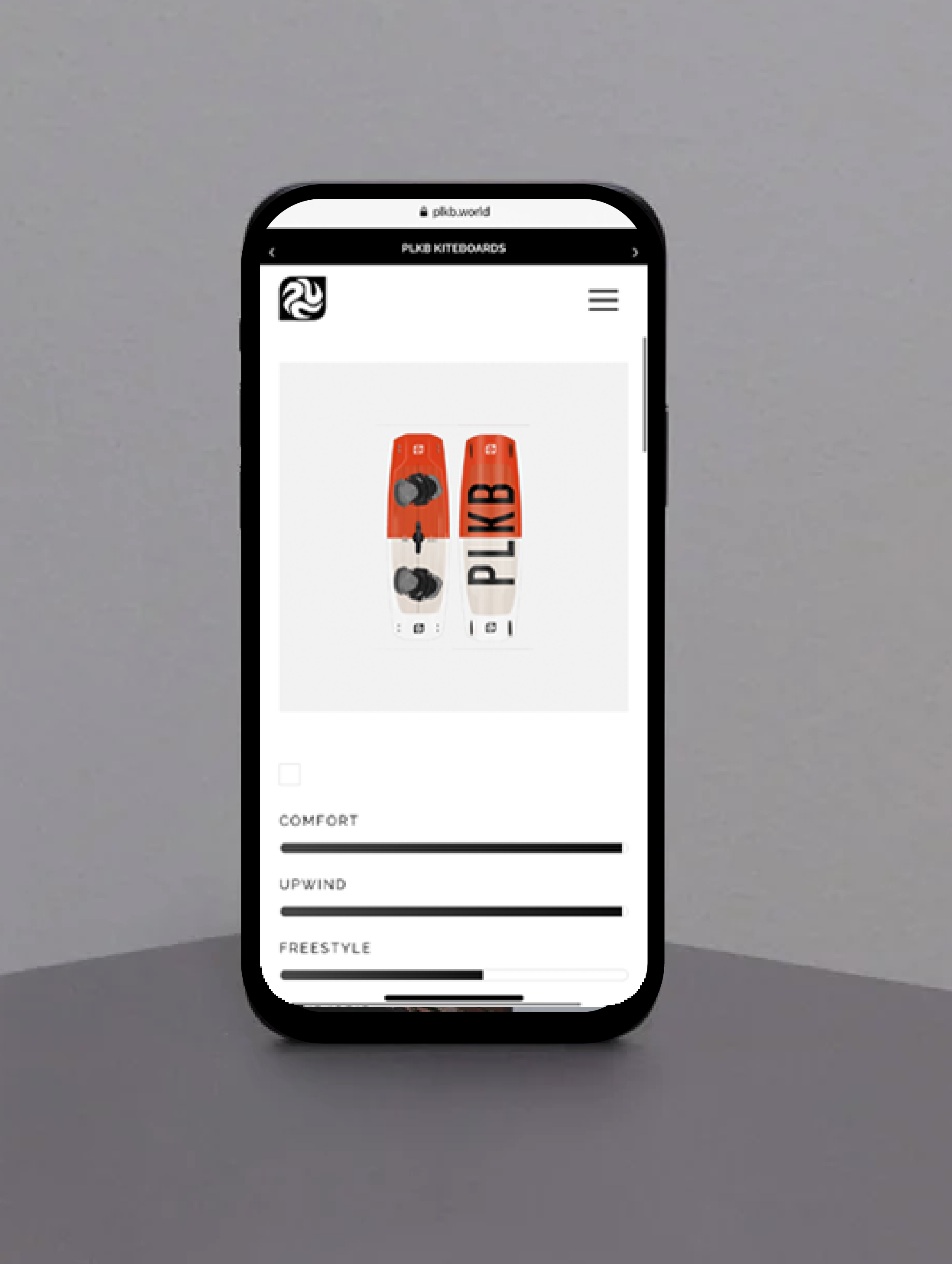
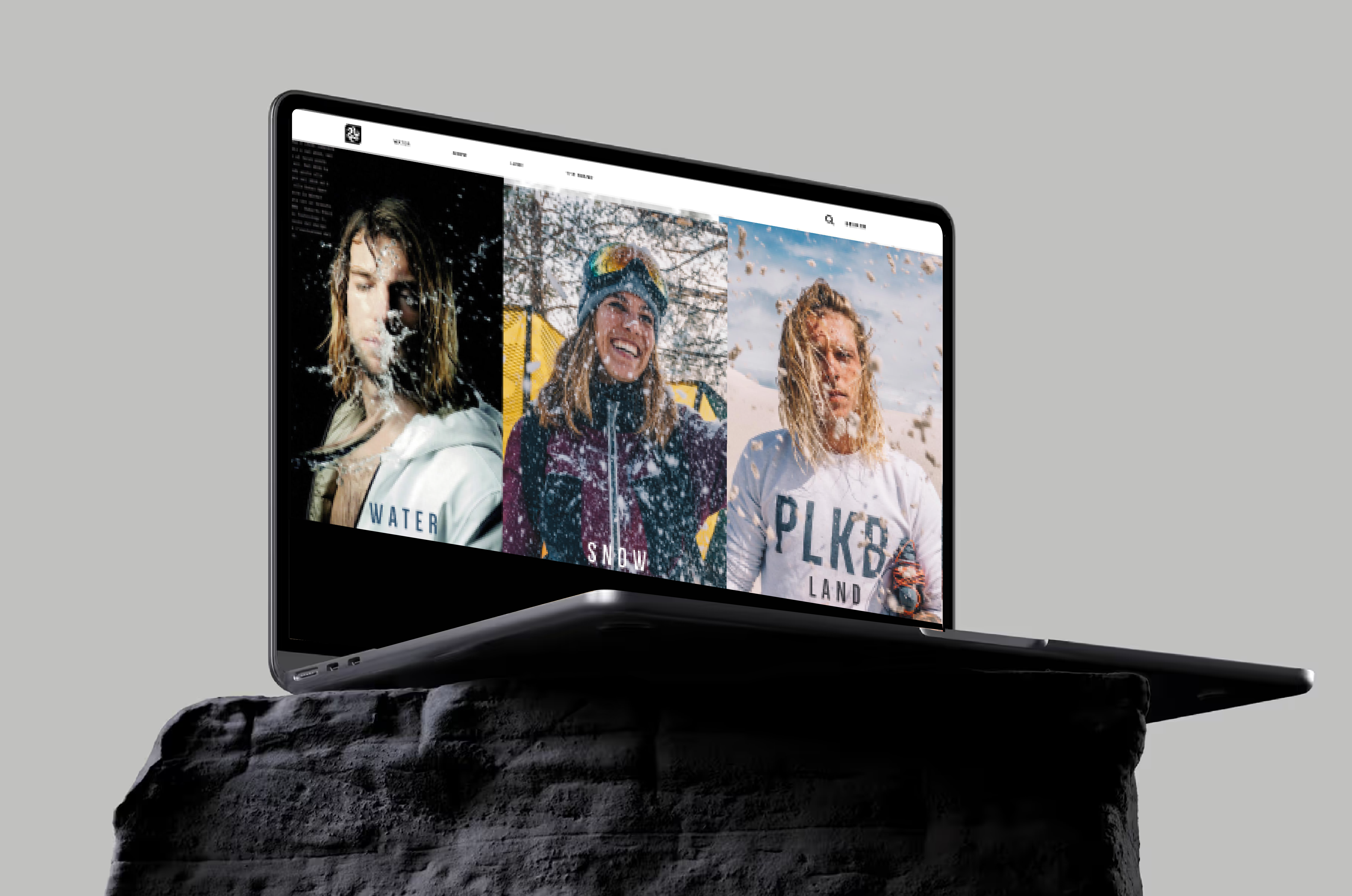
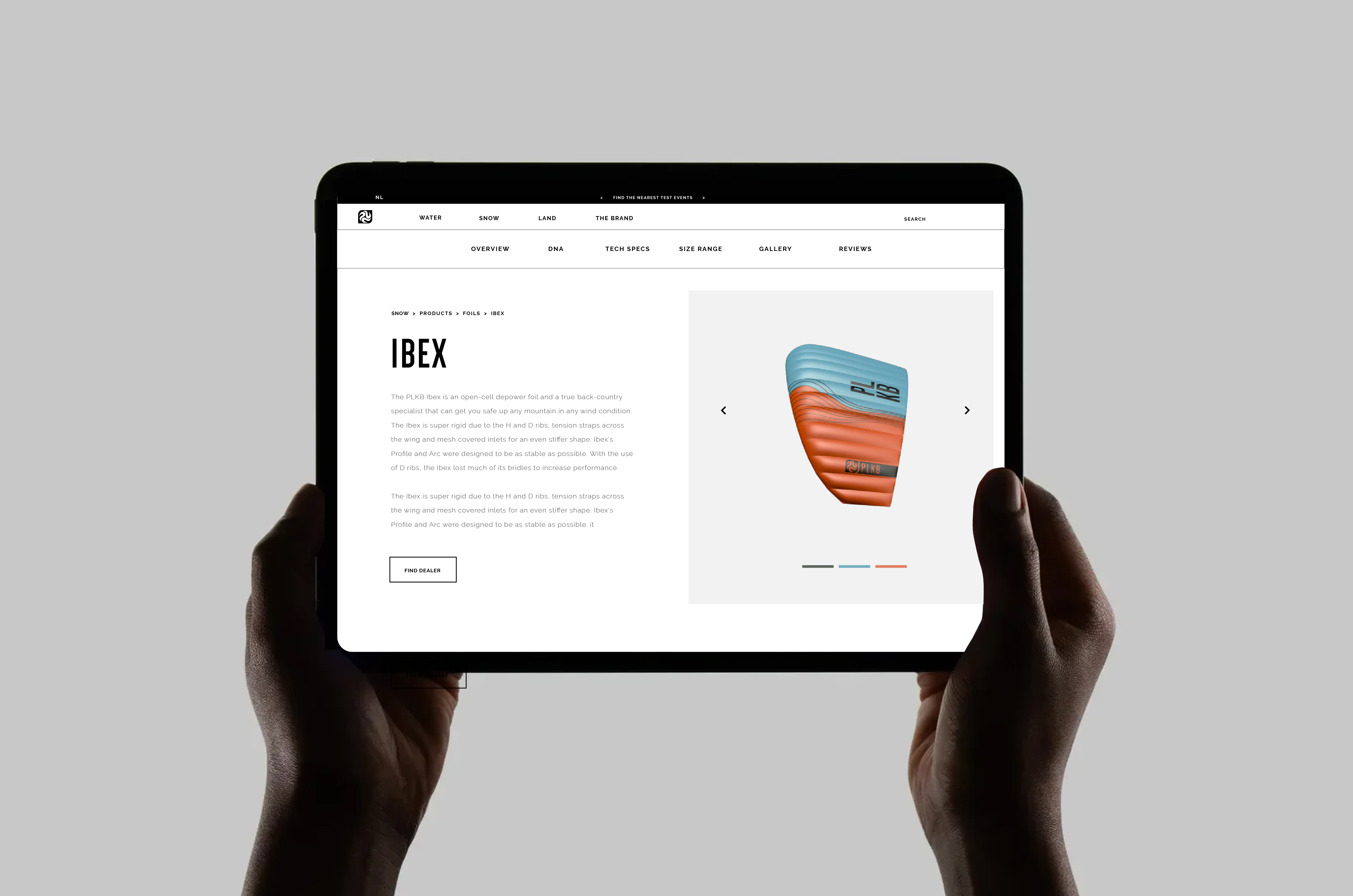
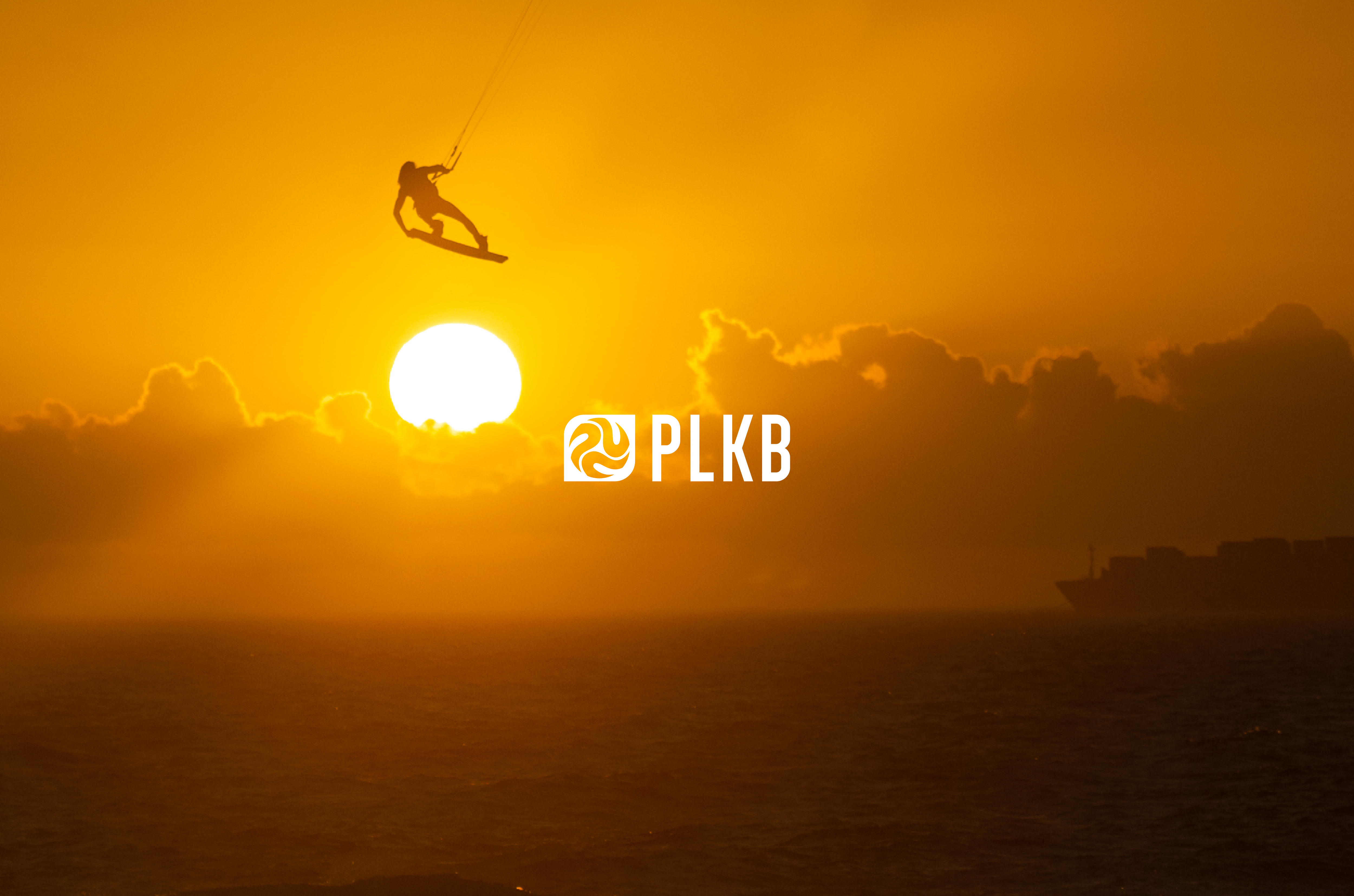
What is Peter Lynn’s vision today, who is it for, and how should that vision translate consistently across website, visual identity, and communication? Peter Lynn Kiteboarding is a brand for everyone—for outlaws, free spirits, and the “cool peeps.” It represents freedom, fun, and the mindset of staying young through sport. This insight became the foundation of the rebrand. Visually, we chose a black-and-white base to create a timeless, inclusive, and high-end identity that transcends trends and speaks to a broad audience. From this concept, the brand slogan “Never Stop Playing” was born—capturing both the joy of kitesurfing and the youthful spirit of the brand. My role extended beyond visual design. I contributed to: Brand strategy and concept development Art direction for photography and video UX/UI design and production of the website Coordination of visual marketing assets across all channels In addition, I activated my network strategically. We collaborated with a well-known influencer (40K+ followers) and organised a content-driven trip to Cape Verde, strengthening the relationship with a key team rider while creating high-impact visual content. This move increased both brand authenticity and reach. Through my connections in the professional kiteboarding world, we also added a world-class team rider, enabling Peter Lynn to compete in KOTA (King of the Air)—the most prestigious competition in kiteboarding. A full production followed in Cape Town, where I acted as art director, model, and team manager, leading a crew consisting of a photographer, videographer, two team riders, and the marketing manager.


-01.jpg)
%20(2).gif)
.gif)