Things we did
Branding, Mission, Vision
Visual design
Infographic design
Client
Element
Year
2023

Turning sustainable construction into a clear, powerful brand.

CHALLENGE
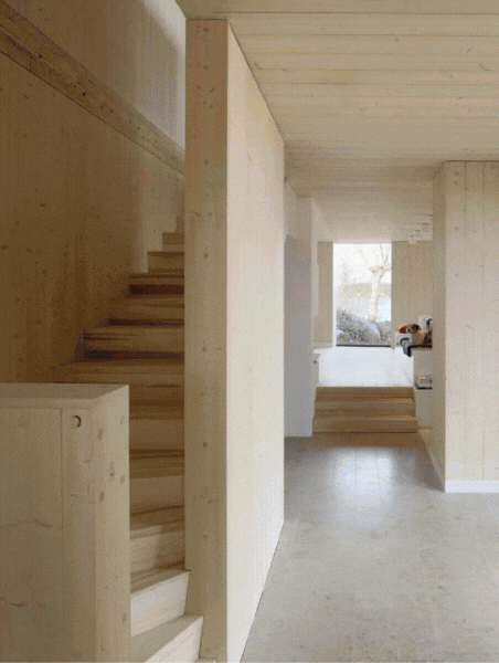
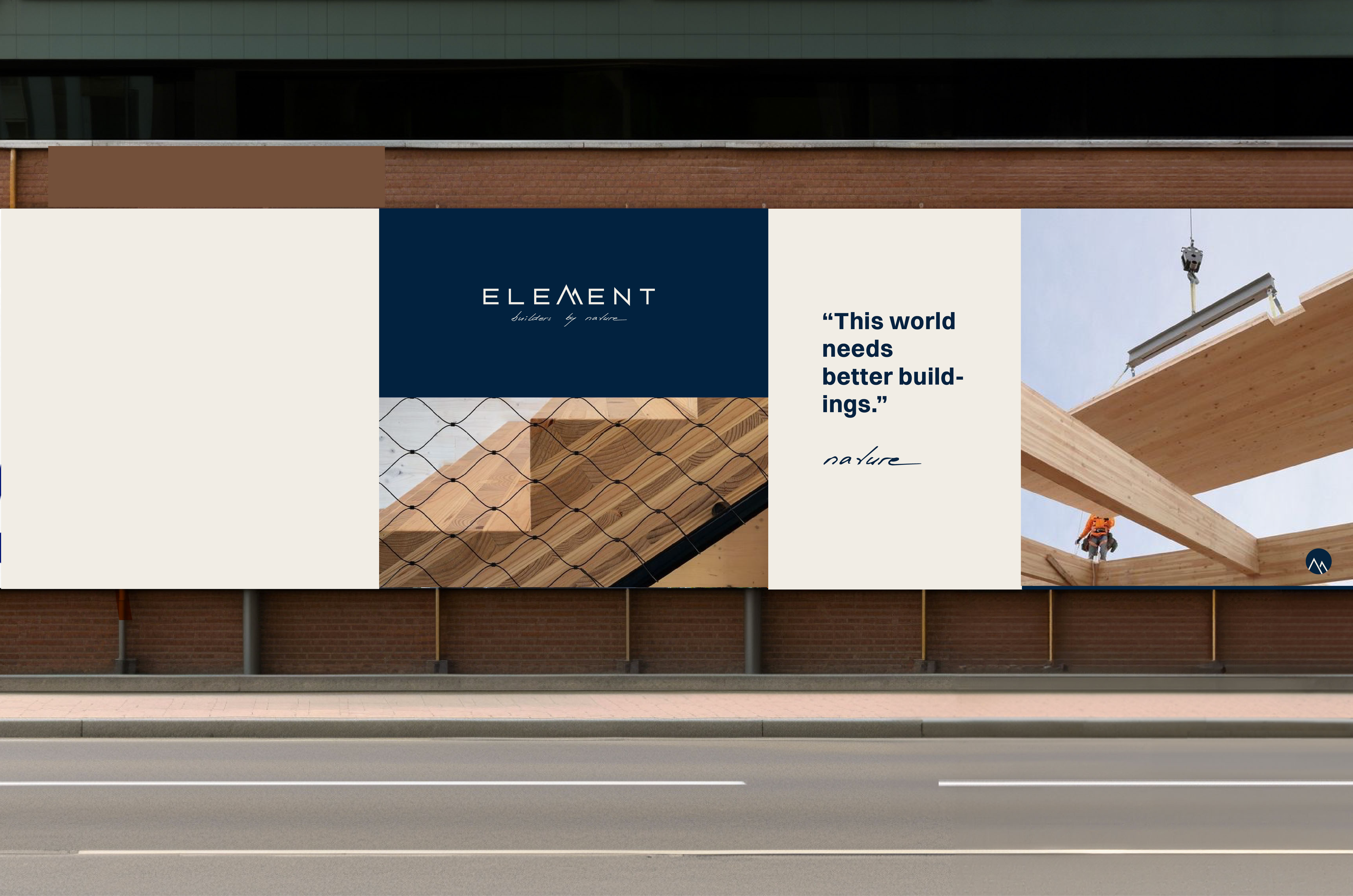
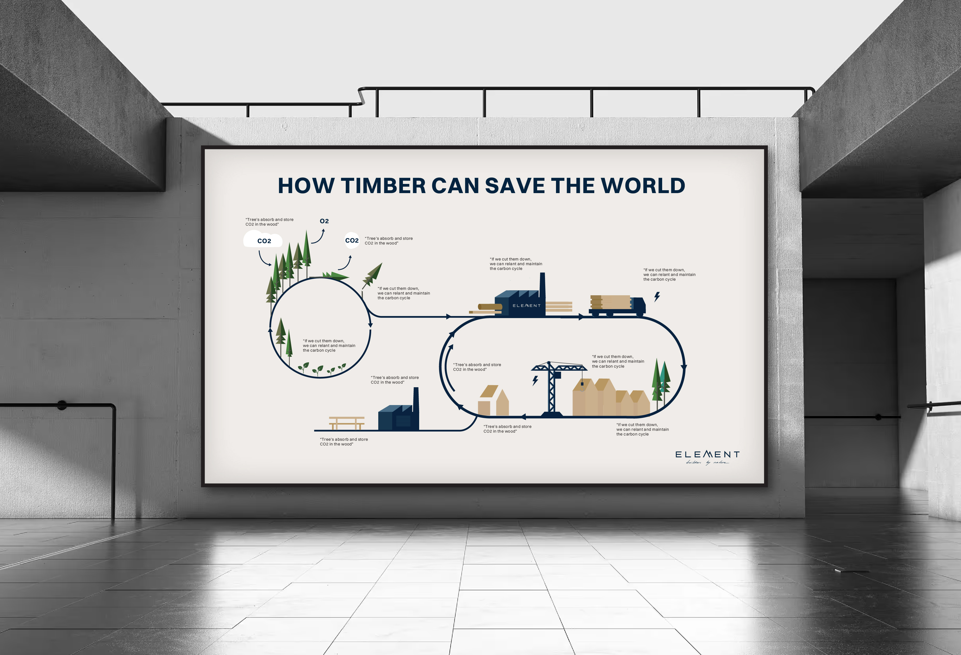
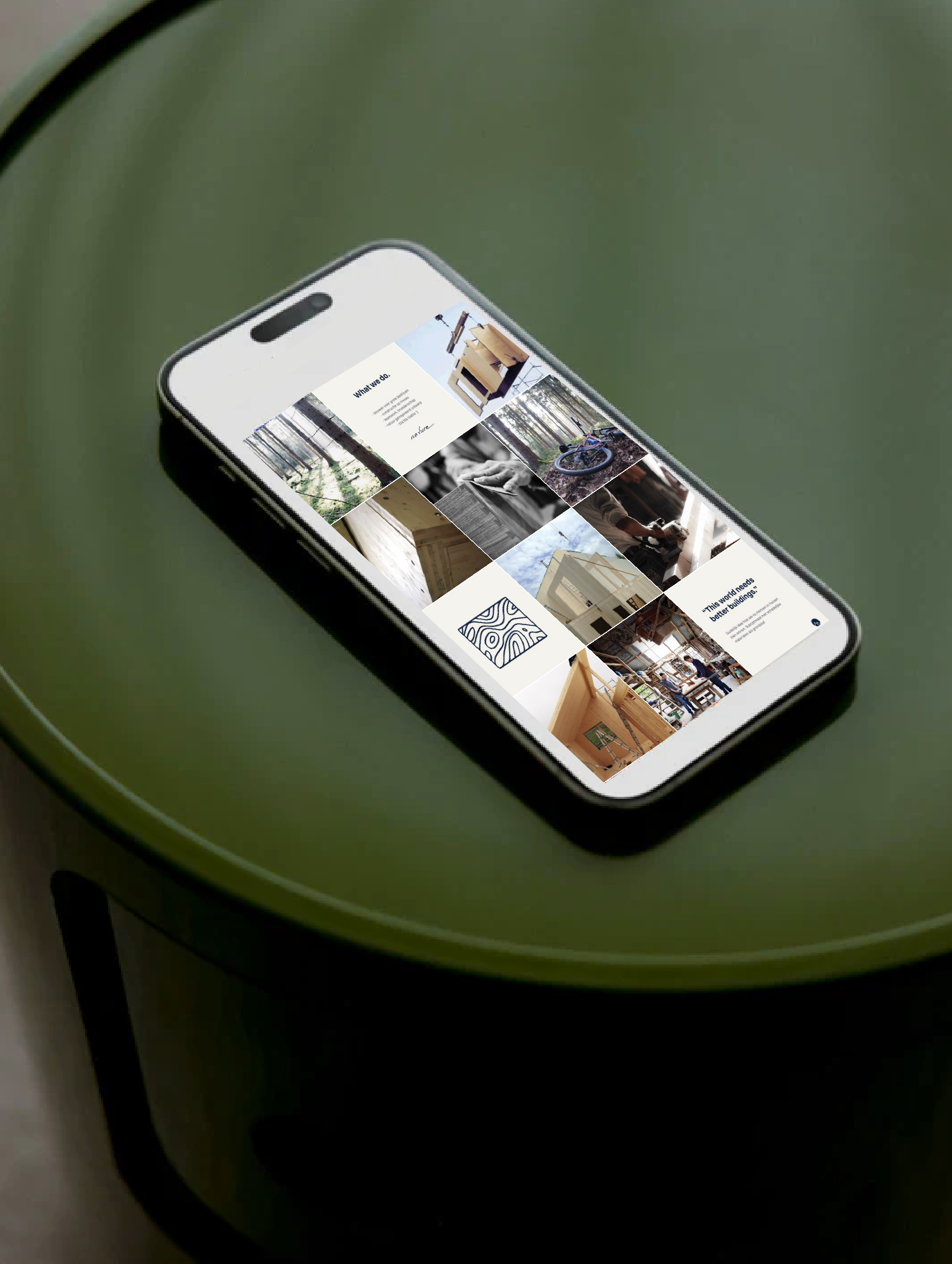
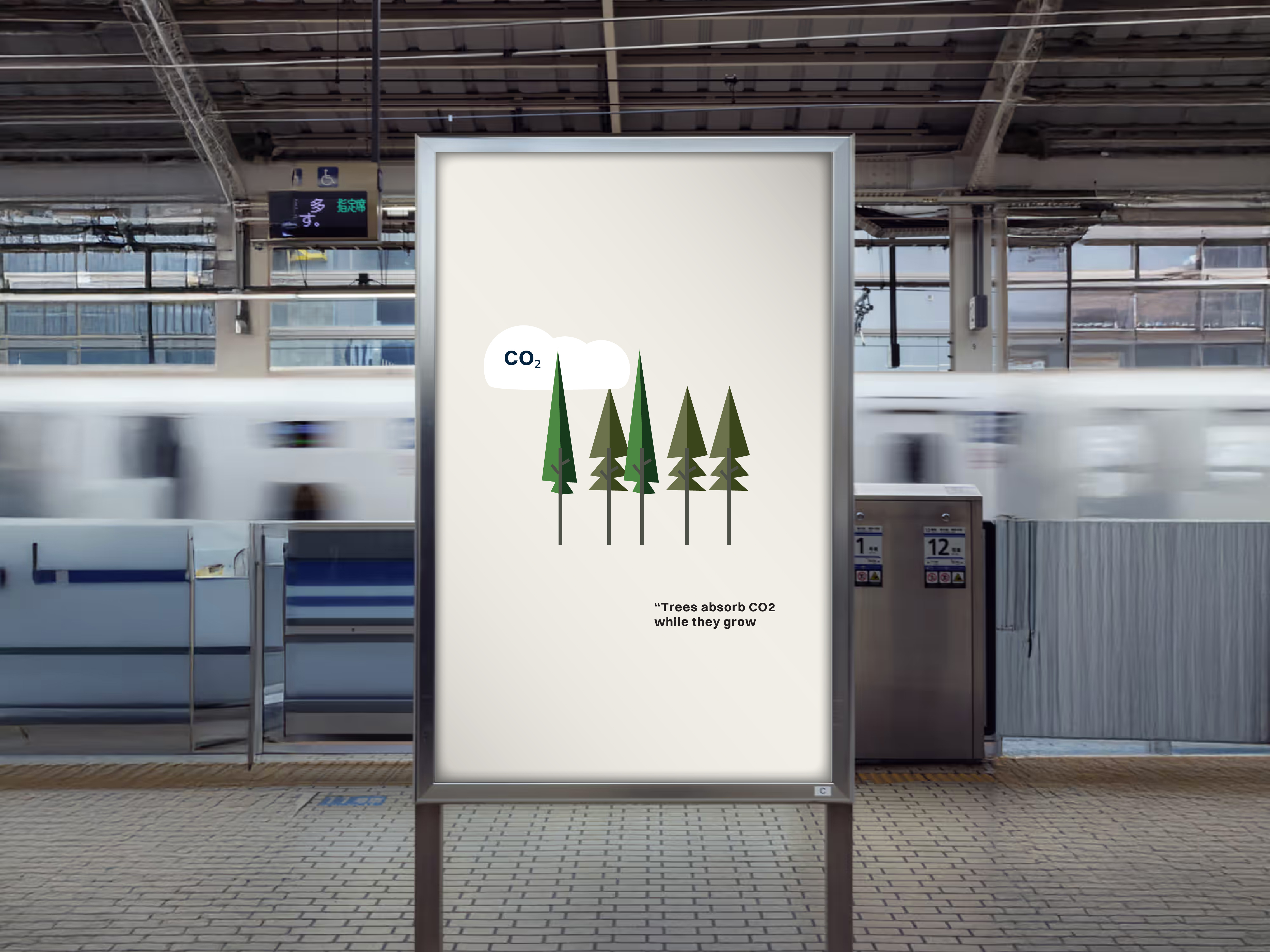
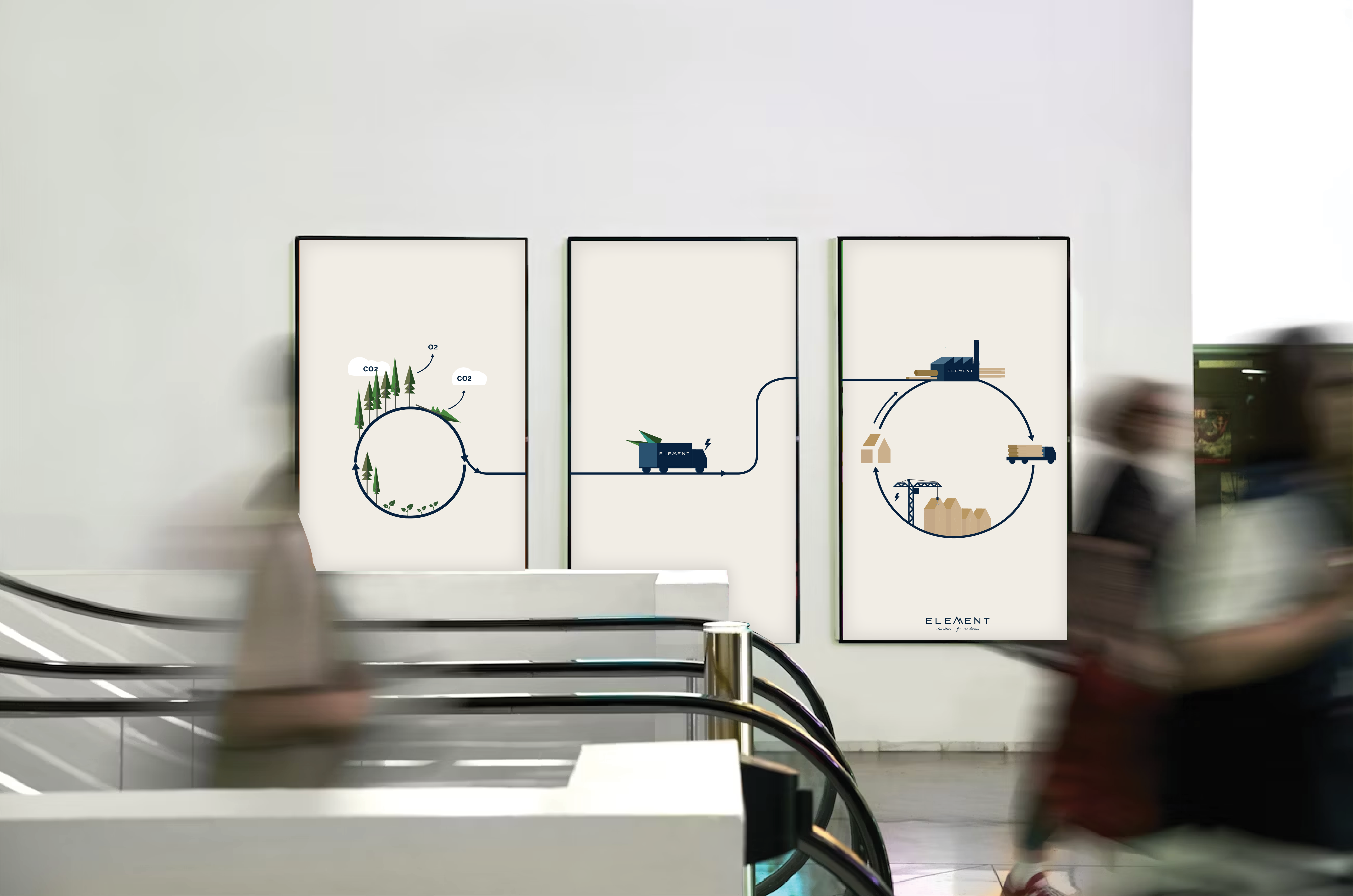
Element is a construction company specialising in building with CLT (Cross-Laminated Timber) — a highly sustainable alternative to traditional concrete construction. While their mission and impact were strong, their brand lacked consistency, clarity, and a recognisable visual identity. The challenge was to create a cohesive, professional brand that clearly communicates Element’s sustainable vision and explains why building with CLT is fundamentally different. The brand needed to feel modern, trustworthy, and innovative, while also making complex sustainability information accessible and engaging.
un-tamed agency logo design voor client
Digital Experiences
un-tamed agency color design for client
un-tamed agency font selection for client
APPROACH
The project started with defining the core story of Element: building better, more sustainable structures by working with nature instead of against it.
The boys of Element come from a family of woodbuilders and with the love of practicing their sports in nature, (like surfing and mountainbiking) they have a true passion to protect nature and to their work in the most sustainable ways. Their strong heritage and history define the quality of their work. Based on these insights I developed a fresh brand identity system that represents the quality of their work.  And brought structure and consistency across all touchpoints. This included:
  • An upgraded logo that feels stronger, more refined, and future-proof
  • A new color palette and typography aligned with sustainability, construction, and innovation
  • A clear and flexible visual language that works across digital and social platforms
Because sustainability can be abstract and technical, a key focus was visual storytelling. I designed infographics and graphic elements that clearly explain how CLT construction stores CO₂ instead of emitting it — in contrast to concrete. By turning complex data into clean, structured visuals, Element’s story became easy to understand and compelling to share.

untamed agency UX design for Client
un-tamed agency icon design
RESULT
The new branding gave Element a clear, consistent, and credible identity that reflects both their technical expertise and sustainable mission.
Key outcomes:
  • A recognisable and coherent visual identity across all platforms
  • Stronger brand clarity and professional positioning
  • Clear visual communication of CLT’s sustainability benefits
  • Increased impact and engagement through infographics and social content
  • A brand system ready to grow alongside the company
  • A brandbook to guide the company in their communication and marketing.
The result is a modern, structured, and sustainable brand that clearly communicates why building with CLT is the future — and why Element is the right partner to build it.

un-tamed agency webdesign
Digital Experiences