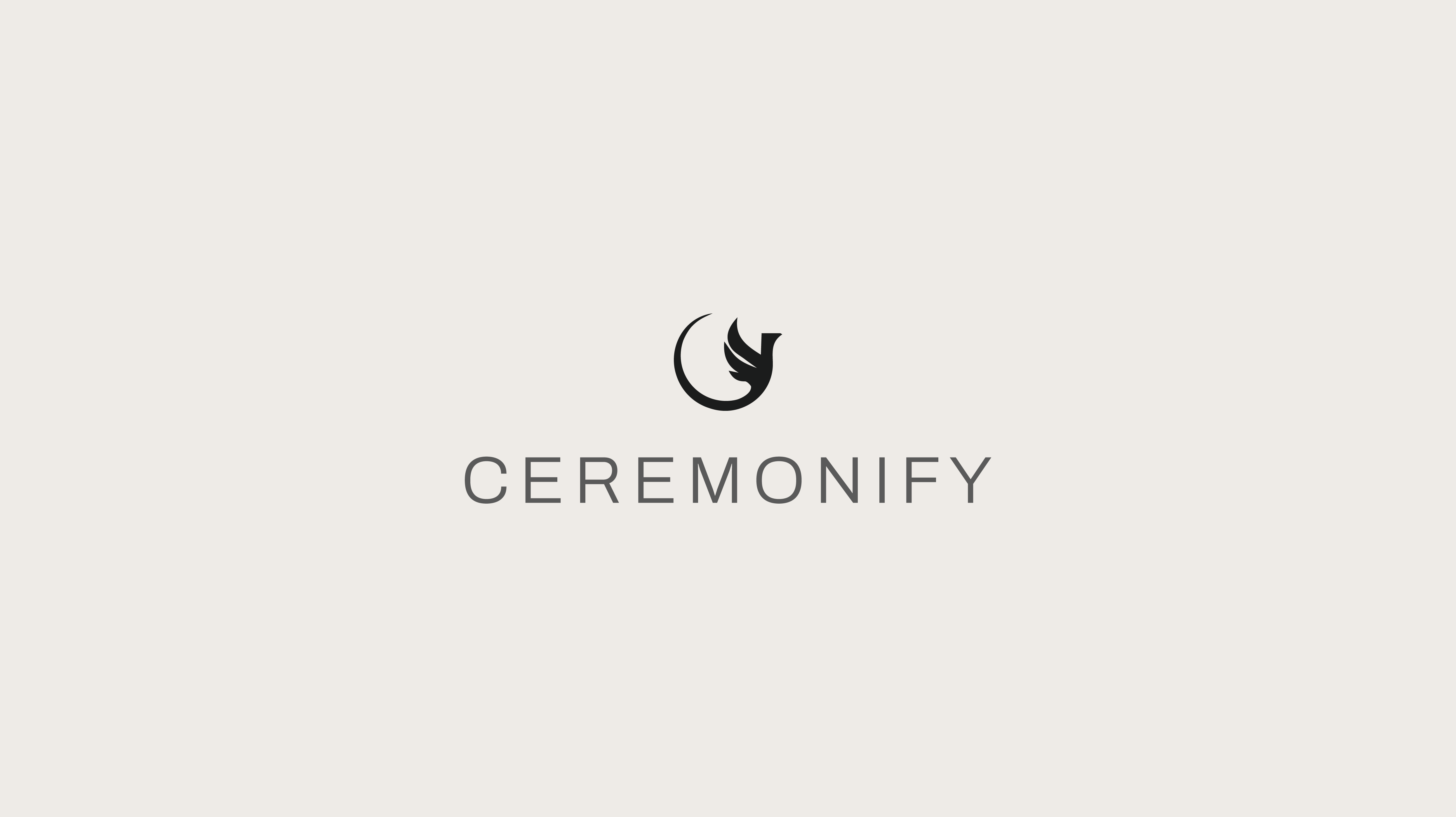
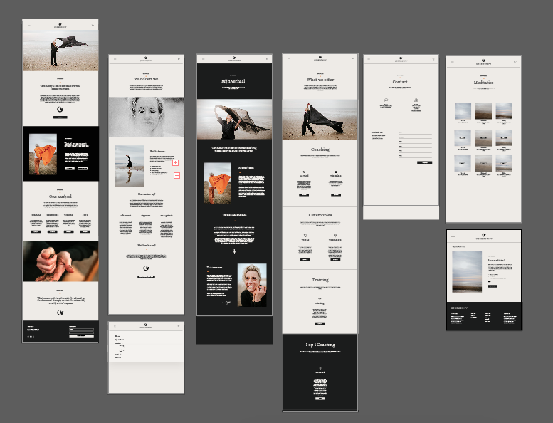
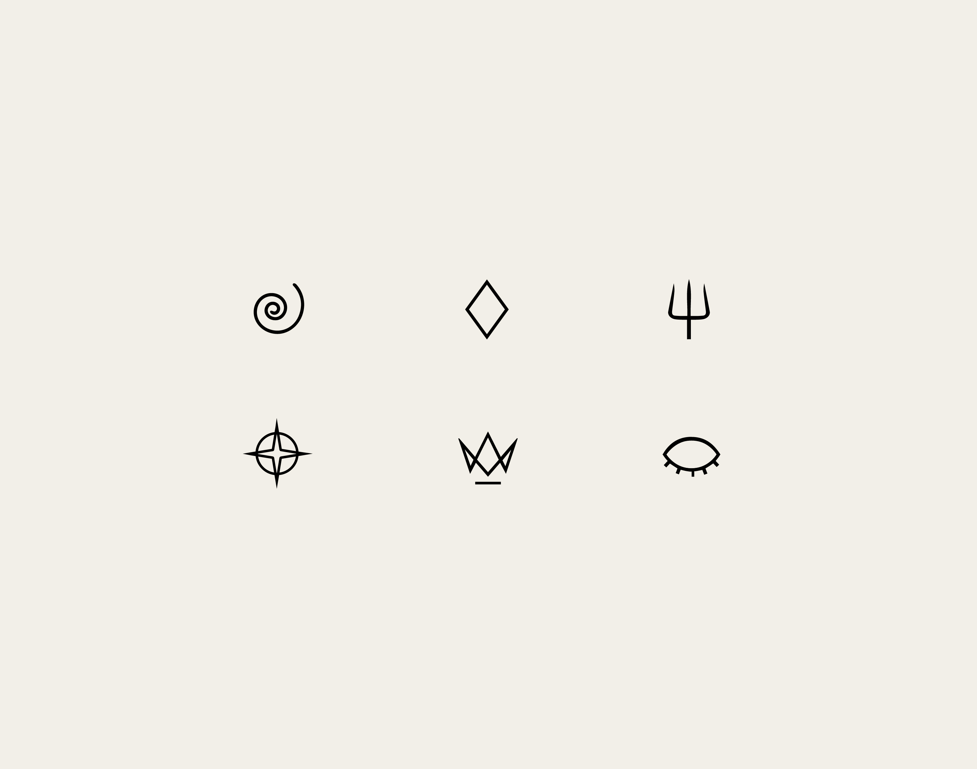
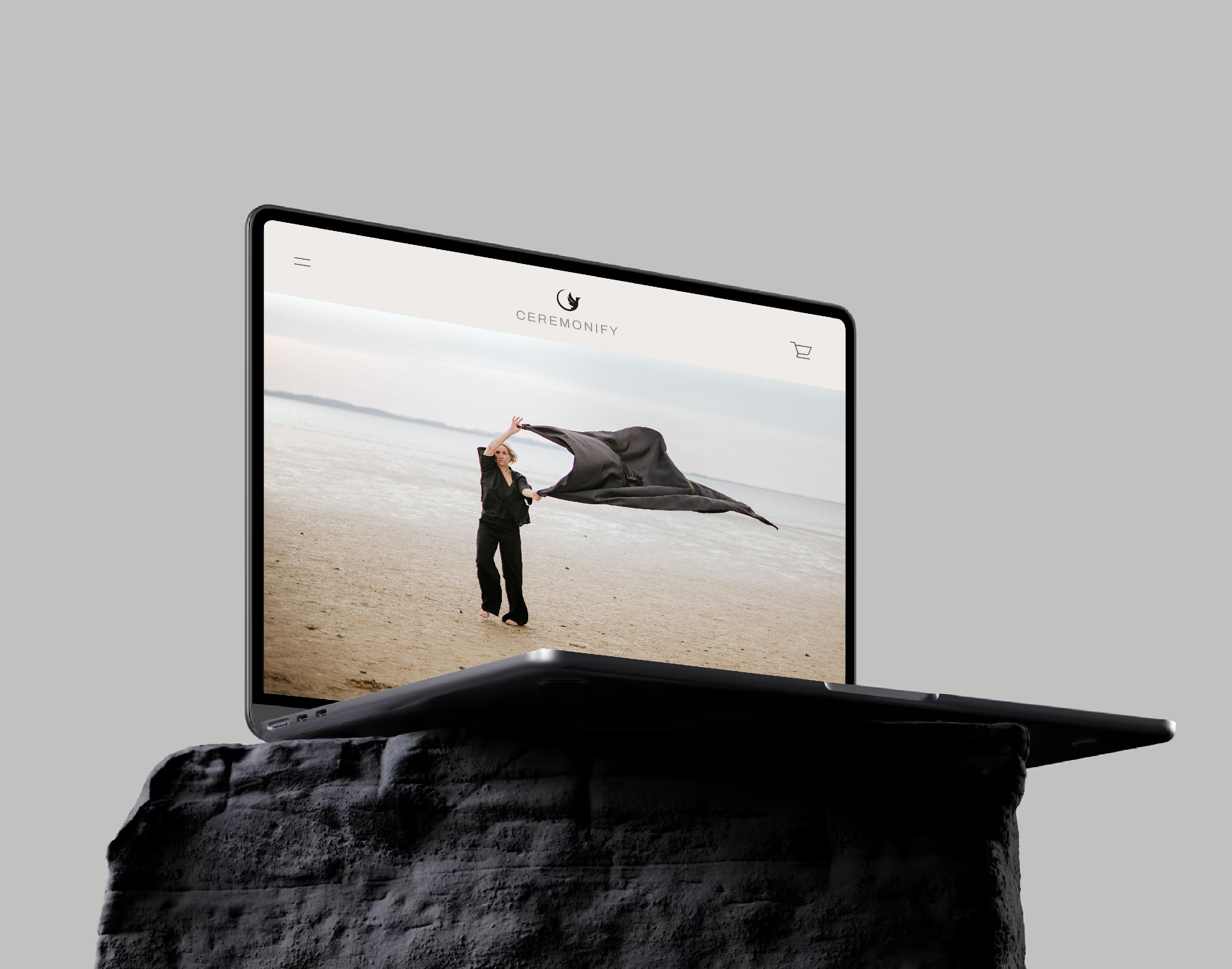
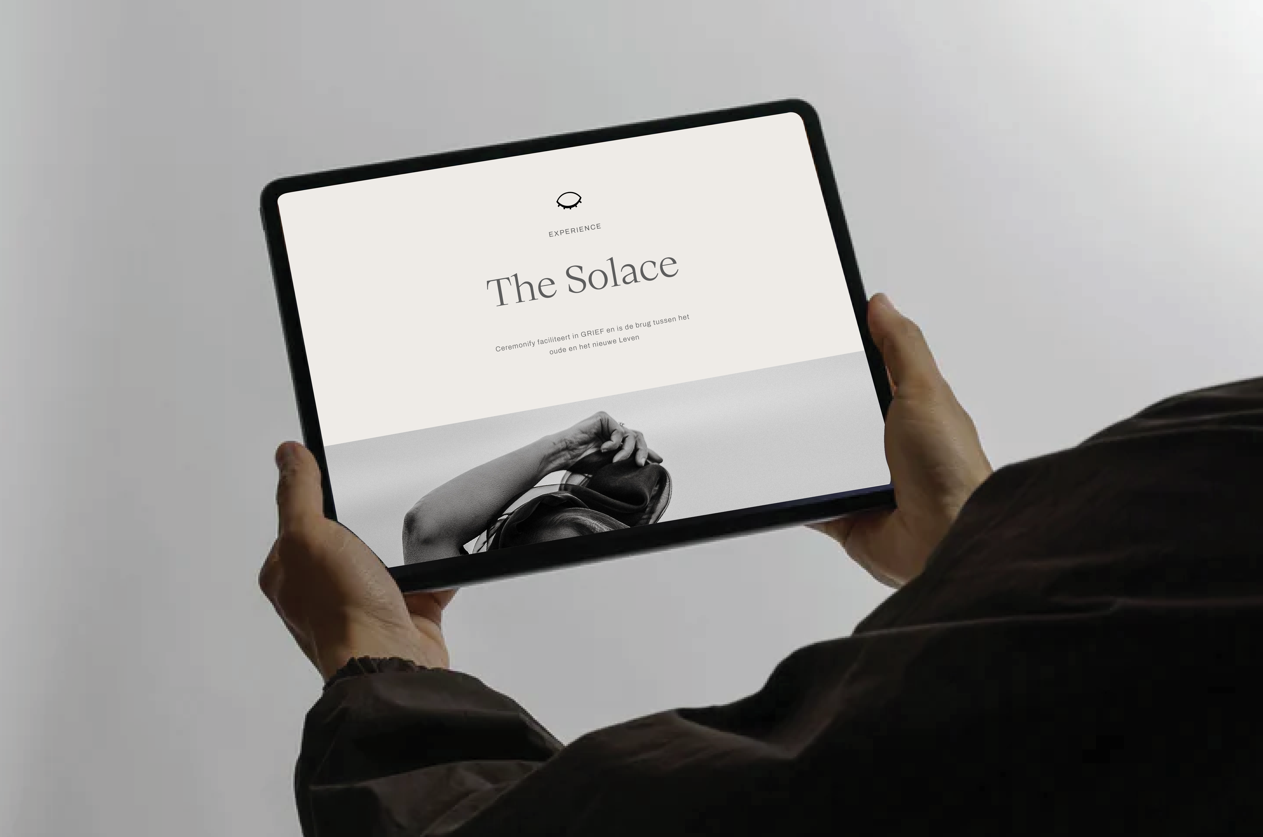
I started by redefining the foundation of the brand, developing a new color palette and visual direction that felt calm, hopeful, and supportive. As the concept evolved, it became clear that a new logo was needed. Inspired by the client’s journey of rebirth and growth, the phoenix was chosen as a central symbol. Alongside this, I designed new icons and took responsibility for the overall structure, UX, and UI of the website. I coordinated the content requirements with the client and worked closely with a web developer to translate the design into a functional and coherent website